
Visual Branding: Why It Starts With Nature
How our brains evolved to see patterns—and why the strongest brands still speak that same visual language.
Visual Branding Introduction
From the vivid plumage of tropical birds to the striking black-and-yellow stripes of a wasp, nature has long relied on visual cues to signal identity, function, and intent. Humans are no different—we are wired to recognize, categorize, and respond to visual information in milliseconds.
In branding, this instinct is not just useful—it’s fundamental.
“The human eye evolved to spot patterns in the wild; great brands use that same instinct to stand out in the marketplace.”
1. Visual Identification Is a Natural Phenomenon
Before we could speak, we saw.
Early humans identified edible fruits, safe shelter, and potential threats visually—long before language developed. The ability to distinguish patterns, shapes, and colors was essential to survival.
Over time, these pattern-recognition skills evolved into social categorization: our natural tendency to group things—and people—based on visible traits. This same instinct applies to brands today.
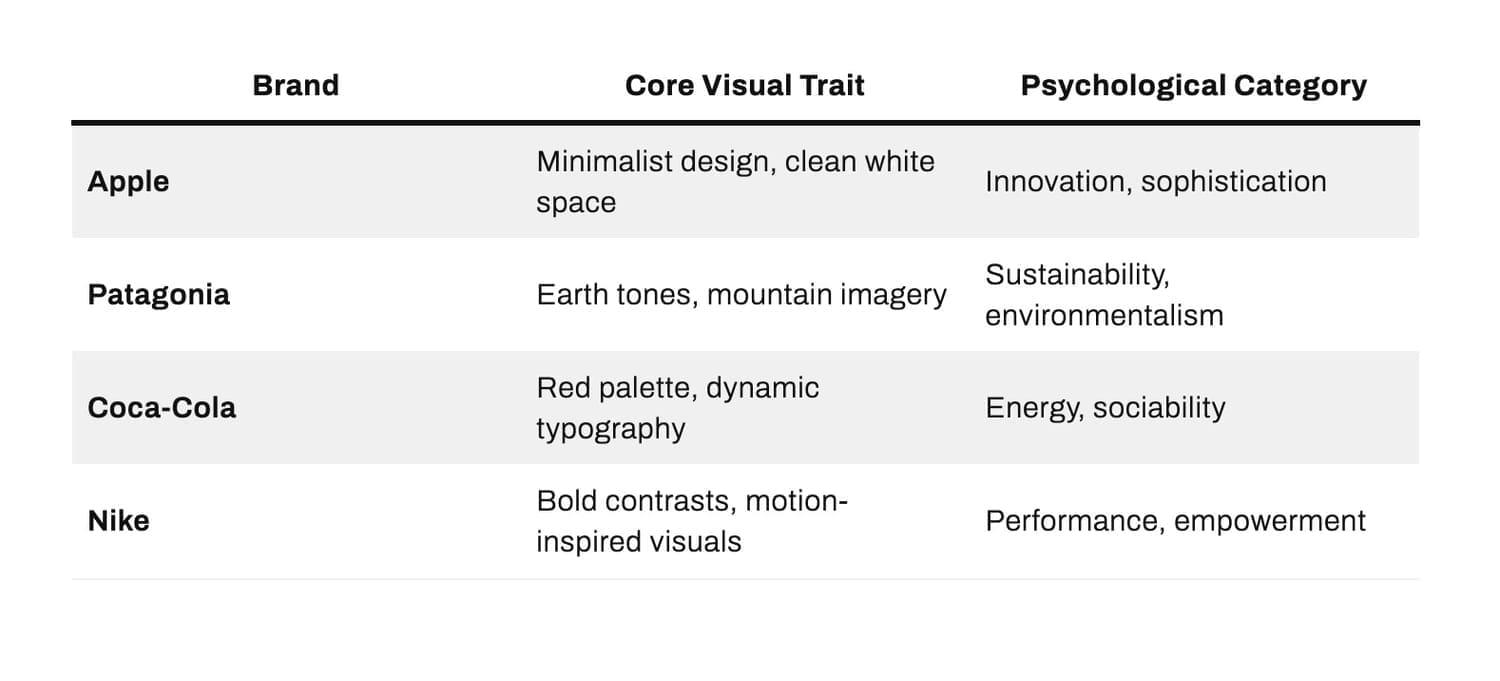
When we see Apple’s minimalist white packaging or Patagonia’s rugged mountain logo, our brains instantly assign meaning. We don’t have to read the text to know what kind of brand we’re looking at.

Atrium Chorus:
2. From Instinct to Industry:
Visual Categorization in Branding
In marketing terms, social categorization explains why consumers quickly sort brands into mental “buckets.”
We group Apple with innovation and simplicity, while Patagonia aligns with sustainability and outdoor integrity. These associations aren’t just built by storytelling—they’re visually encoded.
Visual branding isn’t just decoration—it’s a shortcut to meaning. Our brains crave coherence between what we see and what we believe about a brand.
3. The Advantages and Pitfalls of Visual Categorization
Advantages
Instant Recognition: Colors and shapes act as cognitive shortcuts.
Emotional Anchoring: A familiar visual style builds trust and loyalty.
Tribal Belonging: People align themselves with brands that mirror their identity and values (Apple users, for example, often identify with the brand’s creative ethos).
Inherent Issues
Bias and Oversimplification: Just as in social psychology, categorization can lead to rigid perceptions. A luxury brand may struggle to be seen as “accessible,” even when it diversifies.
Visual Fatigue: Overuse of certain tropes (like “eco-green” for sustainability) can make visuals predictable, diluting impact.
Exclusion: A narrow visual identity might alienate new audiences who don’t “see themselves” in the brand.
“Every logo, every color choice, is an invitation—
or a boundary...”
4. Returning to Nature: Lessons in Authenticity
Nature’s visual systems are efficient because they are honest—a poisonous frog’s bright color warns for survival. Similarly, modern consumers are adept at spotting inauthenticity. A brand that claims “eco-consciousness” but uses wasteful packaging creates visual dissonance, triggering mistrust.
Brands like Patagonia or Allbirds thrive because their visual language (natural colors, organic textures) aligns with their deeper mission. The visual and the ethical reinforce one another, forming a closed loop of trust.
5. Designing With Evolution in Mind
To harness visual branding at its most powerful:
Start with Psychology: Understand what visual cues mean in human perception.
Balance Familiarity and Novelty: Too much sameness feels safe but forgettable; too much novelty can confuse.
Align Inside and Out: Your visuals should match your values and operations—not just your messaging.
Final Thoughts
Visual branding begins in nature—but it thrives in authenticity.
As marketers, designers, and founders, our role is to translate primal instincts into modern signals—creating visual systems that not only capture attention but also nurture belonging.
“We see before we think. We feel before we buy.”
SHARE


Subscribe now.
Sign up for our newsletter to get the most interesting stories of the day straight to your inbox before everyone else
ABOUT
Visual Communication Services: Empowering entrepreneurs and businesses to cultivate a cohesive and impactful brand identity that elevates their lifestyle and bottom line.
Created with ©systeme.io• Privacy policy • Terms of service